design walkthrough: president ages dumbbell chart
This was a chart made for an Axios news story. The newsdesk was working on a story about the ages of U.S. presidents when they entered and exited office, with particular emphasis on Biden and Trump. They reached out to our team to ask for a chart to accompany the story. They were originally thinking of showing a bar chart of the top five oldest U.S. presidents.
First, I asked the reporter clarifying questions to understand what the story was about. I also asked about their deadline and data source. Since the story wasn't tied to a specific news hook, I was able to take a couple of days on this chart. I also needed to find a dataset; I ended up using the Miller Center at UVA since they had birth dates, inauguration dates, and the dates of presidents exiting office.
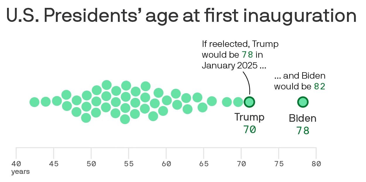
The first chart form that came to mind was a beeswarm chart to show the distribution of ages with labels for Biden and Trump. It raised a couple of questions: would I focus on a president's age at their first inauguration? How would I handle presidents with nonconsecutive terms like Grover Cleveland?
The beeswarm was certainly "good enough." Given that this was a newsdesk story, having a straightforward chart type could be more effective. However, given that the story focused on the age entering and exiting office, I wanted to dig deeper into exploring range before I got back to the reporter.
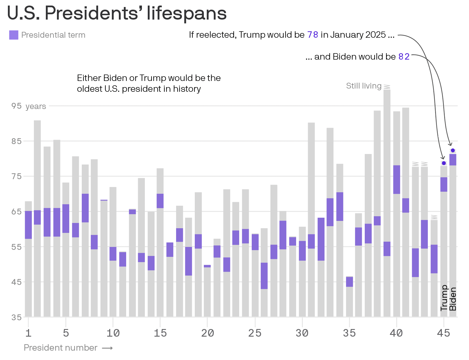
My second draft looked at lifespans with an overlay for the actual term. I used a little zigzag icon for still living presidents. I thought this chart was unique, but quite confusing. Ordering the presidents by number wasn't the clearest and the chart wasted space. Still, this draft nudged me to focus on the overlay part, the time that the presidents were in office.
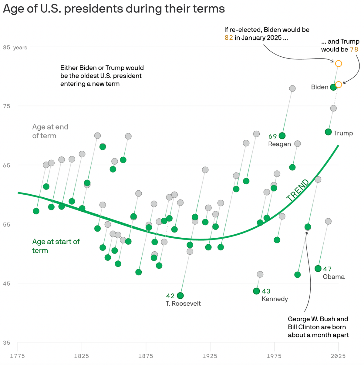
With this direction of focusing on range, I started my next draft: a dumbbell chart. This chart was constructed in Datawrapper and exported as an svg into Illustrator/ai2html. Some key design decisions:
- Creating the dotted lines for presidents serving nonconsecutive terms (ex: Grover Cleveland)
- Adding annotations to guide the reader. Given that this was a more complex chart type, I wanted summary language that delivered a main "takeaway" for the reader. I also wanted to highlight interesting presidents, including those at the oldest or youngest parts of the spectrum.
- Using gradients to help with the movement through the chart. I used green to have a color not associated with any particular president's party.
- Starting the y-axis at 35 since U.S. presidents have to be at least 35 years old.
I went back to my team and the reporter to help narrow down on visual approach. I presented each option, specifically naming each one to be clear what we were referencing. After some back and forth, we decided on option 3, the dumbbell chart.
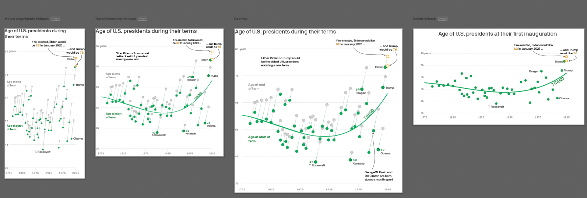
I built out the other artboards and tested the HTML file on different screen sizes. I designed this chart for tablet first since that was the screen size we "optimized" for at axios. I reduced some complexity for mobile formats and the social image and added an additional "fun fact" annotation on desktop.
Overall, I'm proud of this visual because I pushed myself to go beyond a "good enough" solution and I got great reader feedback! We were able to add more nuance to the story beyond just showing the top five oldest presidents and show historical context.